Technical limits
240×160px display resolution
8×8 tile-based character system
ESP32 memory and performance limits
Restricted color palette and render budget
Compact PCB and enclosure footprint
Limited available physical inputs and outputs

View the project on Kickstarter
Embedded control and menu redesign for a handheld glitch instrument
Glitchboy Interface System treats the body, screen, and firmware as one interface problem, not three adjacent ones.
Role
UX/UI Designer
Deployed
April 2026
Scope
Physical controls + embedded menu redesign
Constraints
240×160 display, 8×8 tiles, ESP32, PCB space
Platform
Handheld glitch instrument
01 — Project Overview
Glitchboy was designed as one interface system spanning body, screen, and firmware. The work covered both the physical control layout of the device and the embedded menu redesign running directly on an ESP32-based platform.
The constraints were not a backdrop to the project. Low resolution, limited render budget, restricted inputs, and tight board space shaped nearly every decision, so hierarchy, navigation, and visual identity all had to come directly from the hardware.
02 — The Core Constraint
Technical limits
240×160px display resolution
8×8 tile-based character system
ESP32 memory and performance limits
Restricted color palette and render budget
Compact PCB and enclosure footprint
Limited available physical inputs and outputs
Design response
Hierarchy built through spacing, framing, and inversion instead of heavy graphics
Short navigation paths with fewer context switches
Contextual overlays instead of extra screens
A bitmap font chosen for legibility under compression
Control groupings shaped around tactile use, not visual spacing alone
Playful sprite details used only where they improved orientation and personality
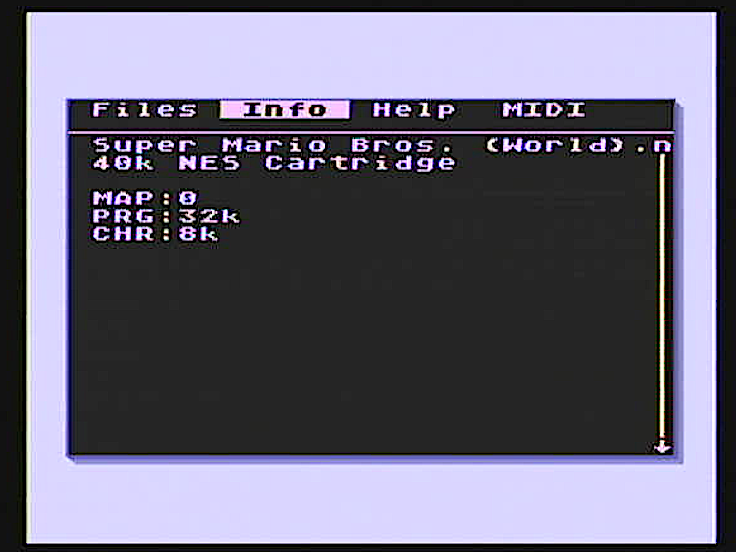
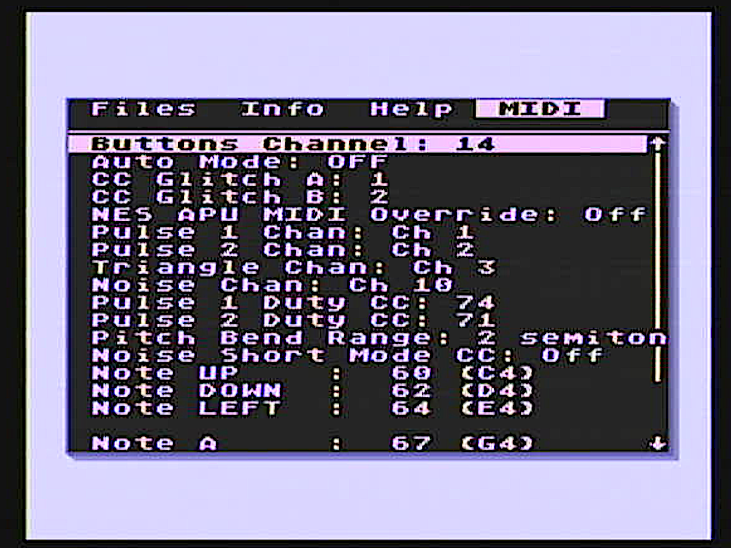
03 — Before → After: Menu Interface
Before / emulator-derived menu
Labels, values, and metadata competed for equal weight, so the interface felt denser than it needed to.
ROM information lived in a separate tab, forcing users to break browsing flow just to inspect context.
MIDI settings were dense, with weak grouping and poor scan speed.
A dedicated Help section repeated guidance the interface should have made clear by itself.
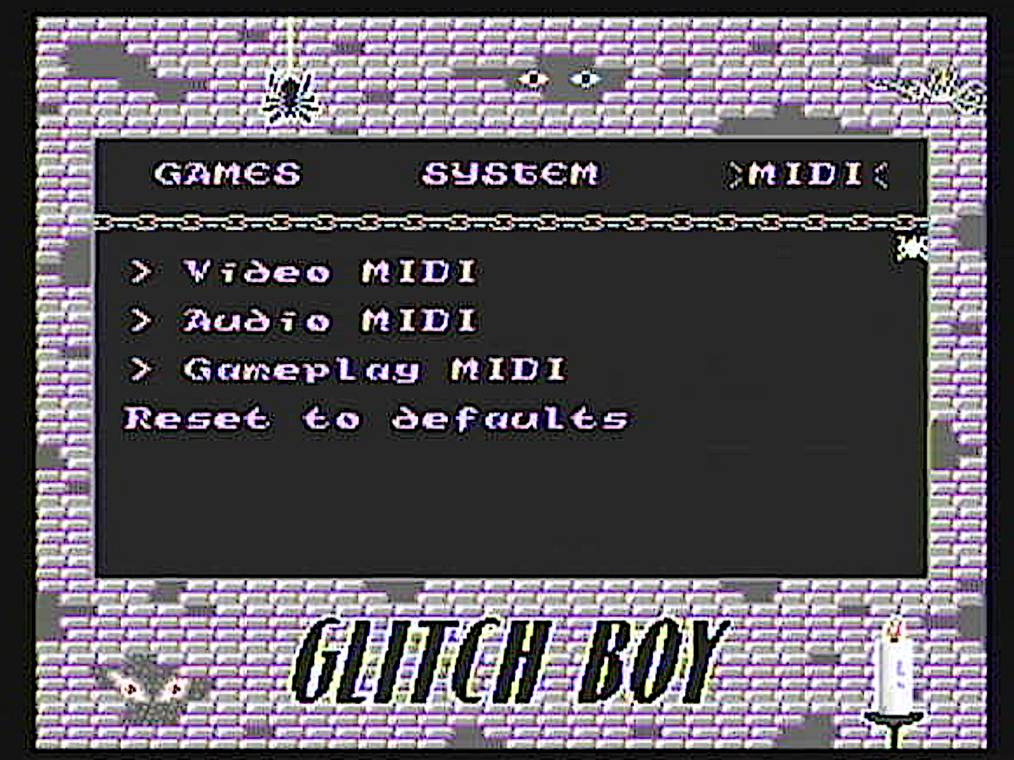
After / redesigned Glitchboy menu
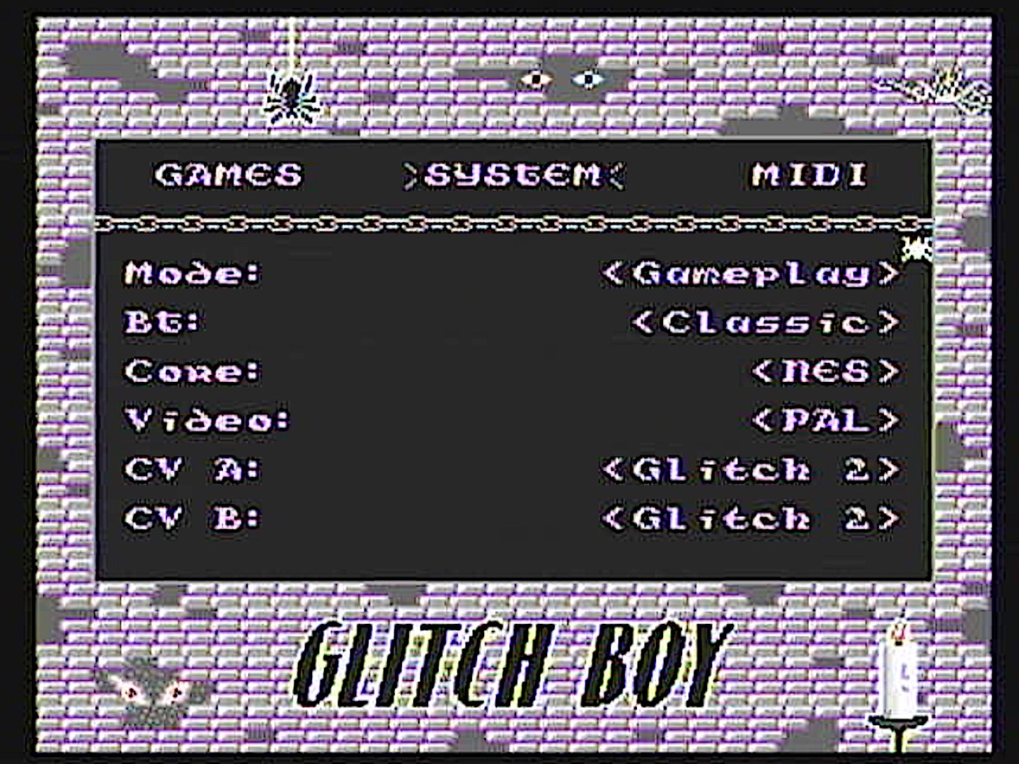
Contextual popups surface ROM and cartridge information directly inside the browser flow.
Spacing, framing, and inversion create clearer hierarchy without adding interface weight.
MIDI controls are reorganized into functional groups that scan faster and read more cleanly.
Redundant help content drops away because the menu itself is more legible and self-explanatory.
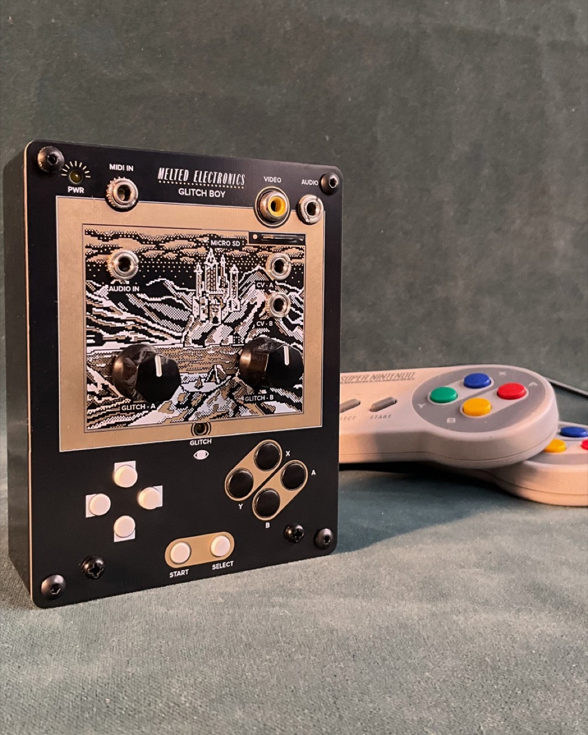
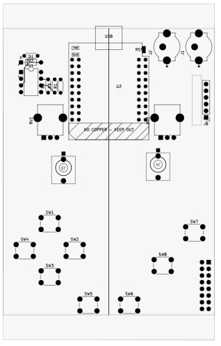
04 — Physical Interface
The physical layout was not a separate industrial-design exercise. It had to work in step with the menu system, the available inputs on the ESP32, and the compact footprint of the hardware itself.
Process
The interface started with three parallel checks: how the controls could sit within the PCB, how the enclosure face could stay legible, and how the input groups should map back to the menu system. These studies were used to test placement, comfort, and hardware feasibility before the final layout was locked.
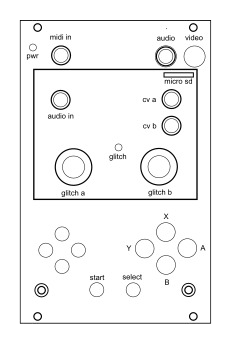
Schematic drawings of the physical interface.
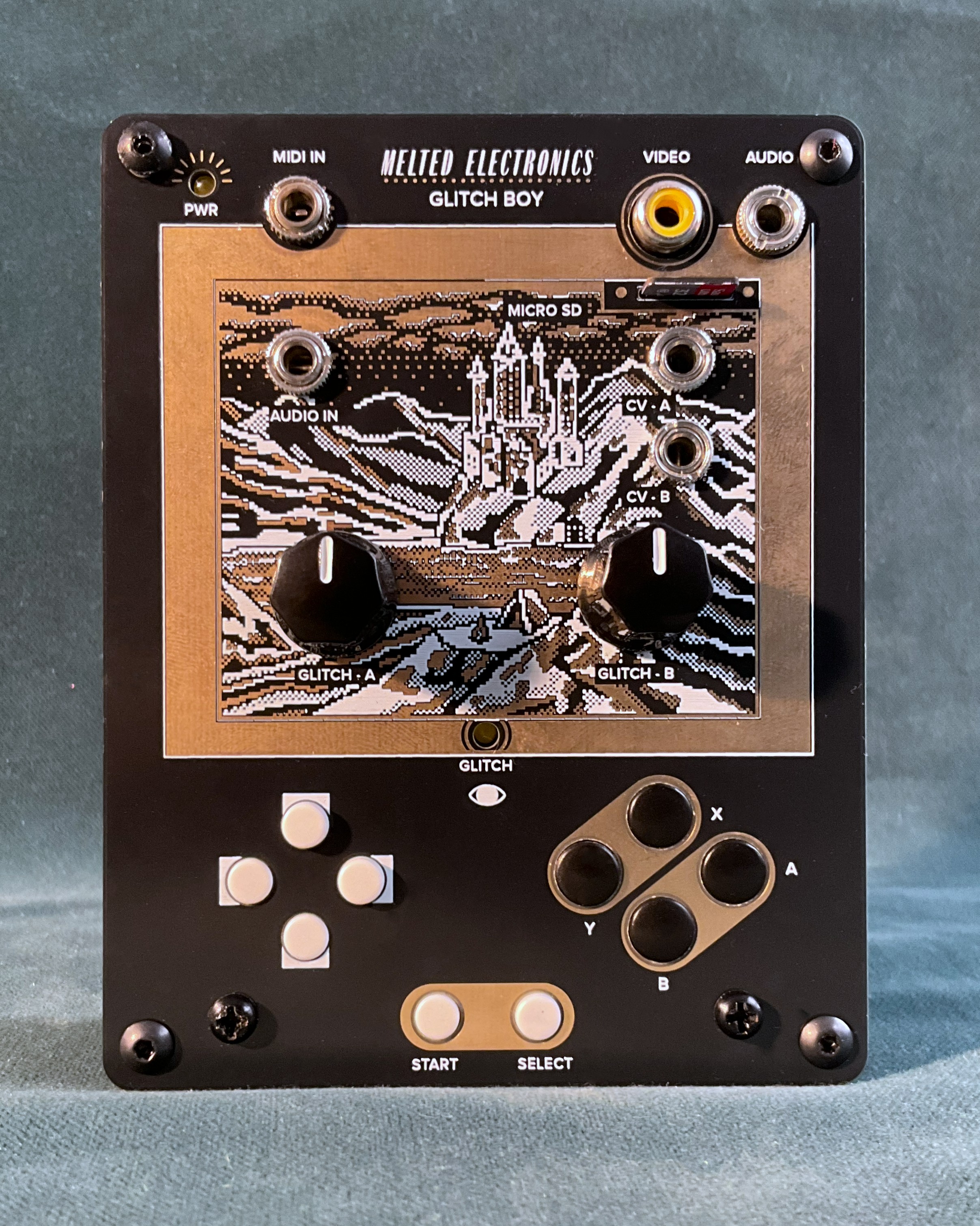
Final layout
Control placement had to fit the board and enclosure without turning the device into a thumb puzzle.
Inputs were grouped by frequency and risk so common actions stayed easy to reach and harder to trigger by accident.
The menu logic was designed alongside the controls, so movement on the device mapped cleanly to movement on screen.
05 — System Thinking
01
Buttons and controls establish the hierarchy of what can be changed quickly during use.
02
The embedded UI keeps paths short, surfaces details contextually, and reduces needless traversal.
03
Clear states, framed values, and authored sprites confirm where the user is and what changed.
06 — Outcome
A clearer embedded UI that feels calmer under severe display and memory limits.
Less navigation friction, especially around ROM information and parameter inspection.
More readable settings and stronger grouping in the densest technical sections.
A product personality that stays raw and playful without giving up usability.
A system that remains credible within real hardware, firmware, and enclosure constraints.