Reference mapping
Visual and behavioral references from analog video systems, CRT interfaces, underground broadcasts, and electronics packaging.

A storefront for experimental video hardware
Melted Electronics needed a storefront that introduced the culture around the devices before asking for a purchase. The redesign uses interaction, documentation, and shopping as one connected entry experience rather than defaulting to a product-first ecommerce flow.
Role
UX/UI Designer
Deployed
May 2026
Type
Experimental hardware website
Tools
Astro, Codex, Figma
Focus
Discovery, interaction, conversion
Project methodology
The process moved between atmosphere, information structure, and commerce logic simultaneously. The most useful artifacts were the ones that tested how those three things could coexist without one overriding the others.
Visual and behavioral references from analog video systems, CRT interfaces, underground broadcasts, and electronics packaging.
Established the homepage as a discovery layer first. Defined where direct shopping should branch from that context.
Explored how distortion, motion, and media previews could explain the hardware without the interface becoming friction.
Separated discovery, documentation, and purchase into distinct paths so each area could move at its own pace.
Reduced noise, localized intensity, and made sure the strongest brand moments stayed memorable rather than exhausting.
01 — Brief
The client was clear: the site should not feel product-first. The world built around the devices matters more than the devices alone — the homepage had to function as discovery before it functioned as a store.
The problem was making that discovery layer useful rather than indulgent. Visitors needed to understand what Melted Electronics is, explore the hardware's outputs, follow releases, and still reach purchase without friction once they were ready.
The entry experience introduces the world around the products first. Commerce emerges from that context rather than leading it.
The site borrows from distortion, noise, and analog instability — but the interaction model stays readable enough for browsing, comparison, and purchase.
The strongest interactive moments behave like demonstrations. Users learn what the devices do by manipulating the page, not by reading a static description.
02 — Direction
The visual language draws from analog video systems, CRT interfaces, underground music culture, and older electronics packaging. The challenge was deciding how far the site could lean into that world without becoming harder to browse.
Early directions pushed further into distortion and unstable layouts, but the most useful design move turned out to be restraint. The final system keeps the atmosphere of those references while preserving readable hierarchy and familiar navigation underneath.
03 — Interactivity
The interactive moments on the homepage function as product explanation, not decoration. Rather than applying glitch as a surface treatment, the design translates Melted Electronics' analog signal language into the interface itself — through draggable controls, signal-state shifts, CRT-like loading behavior, and distorted media interactions.
A distortion slider built into the hero lets users progressively destabilize the page, simulating analog interference. To make this work at the level of the actual video output, we built a custom GLSL shader in collaboration with Melted Electronics — it applies real-time glitch directly to the hero video, turning the brand's core visual behavior into something the user controls. A separate section introduces a navigable 3D CRT where channel-switching cycles through visual outputs made with the hardware. The underlying principle: users understand the brand by manipulating the page, not by reading about it.
Interaction 01
Interaction 02
04 — Structure
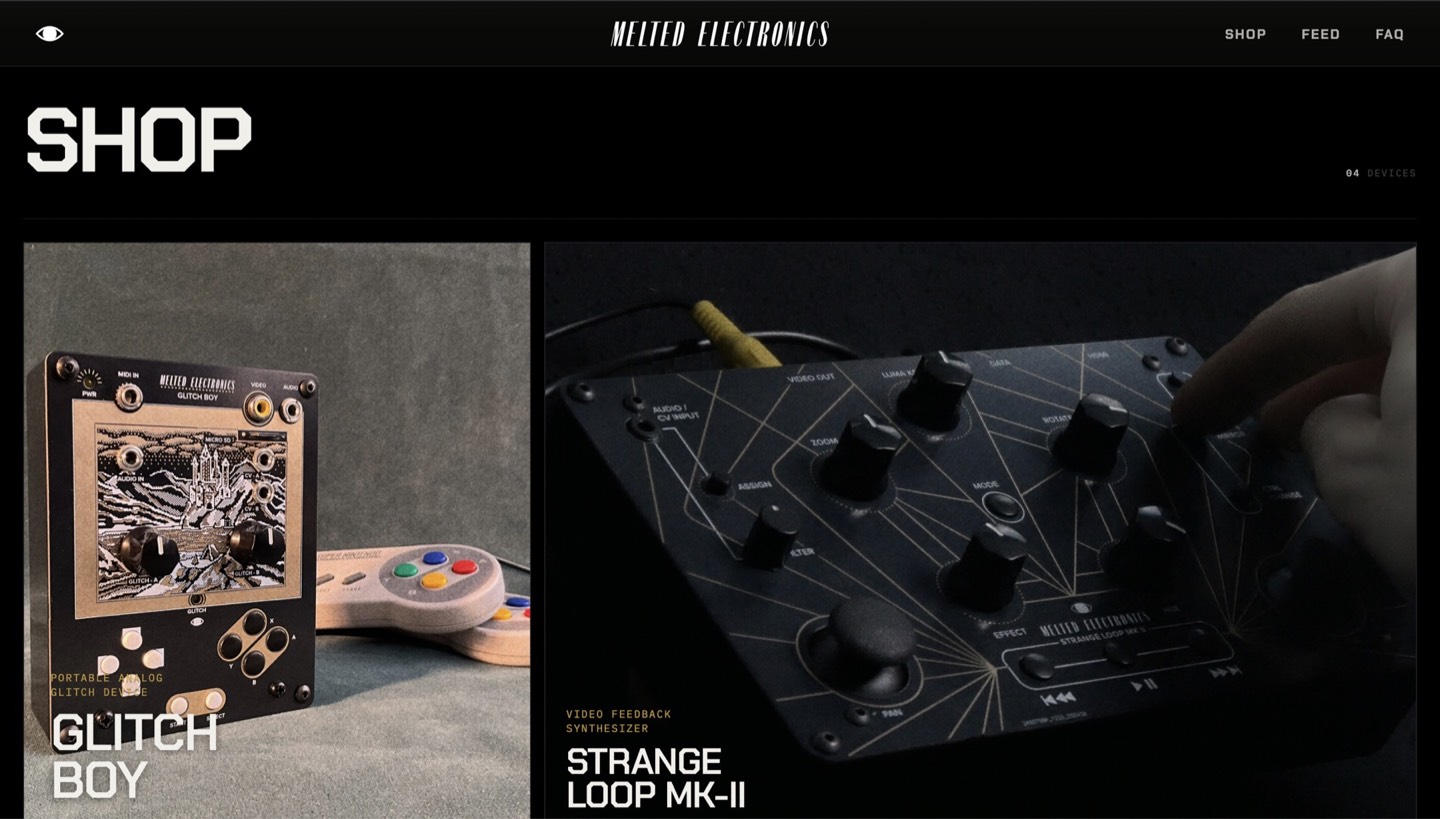
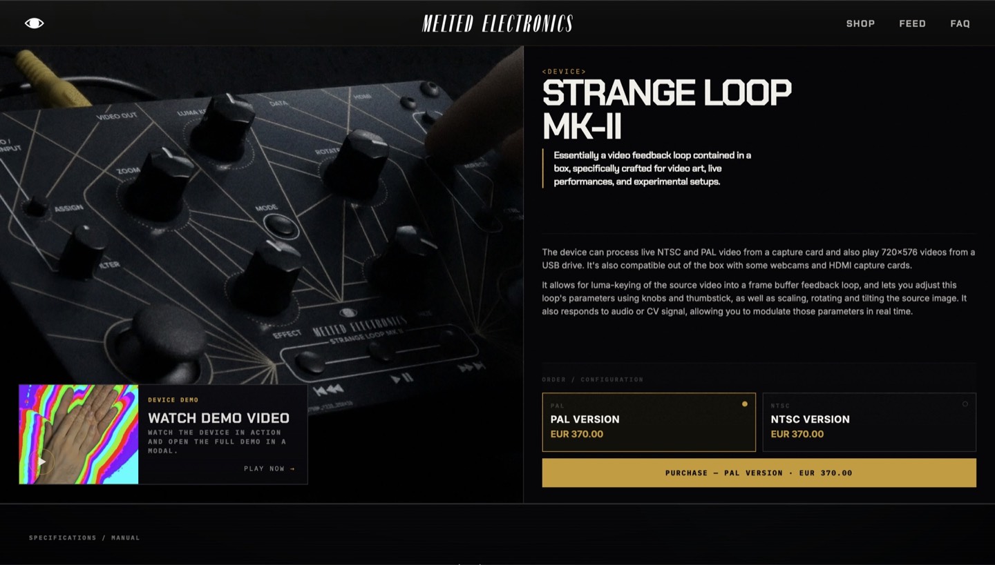
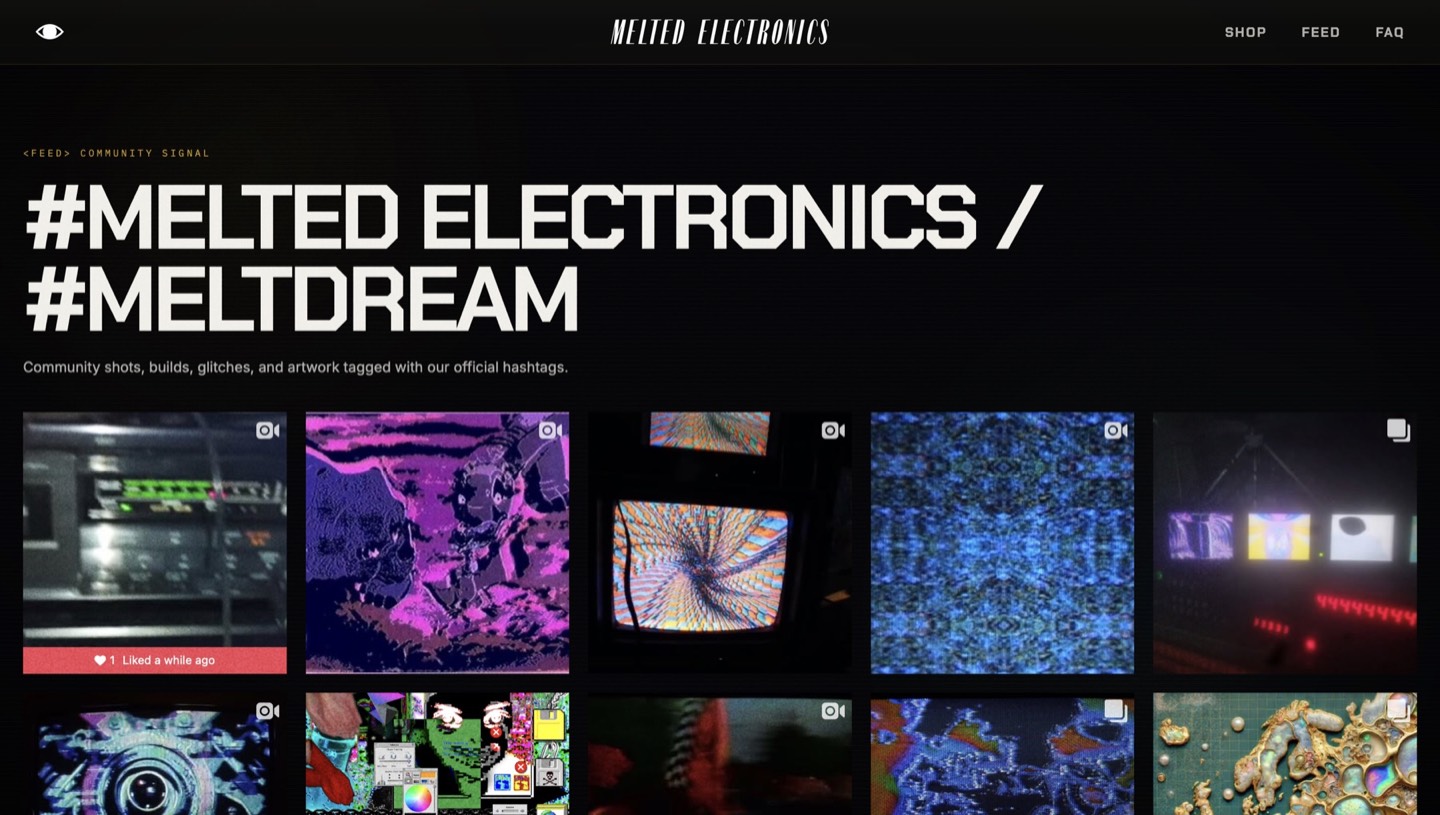
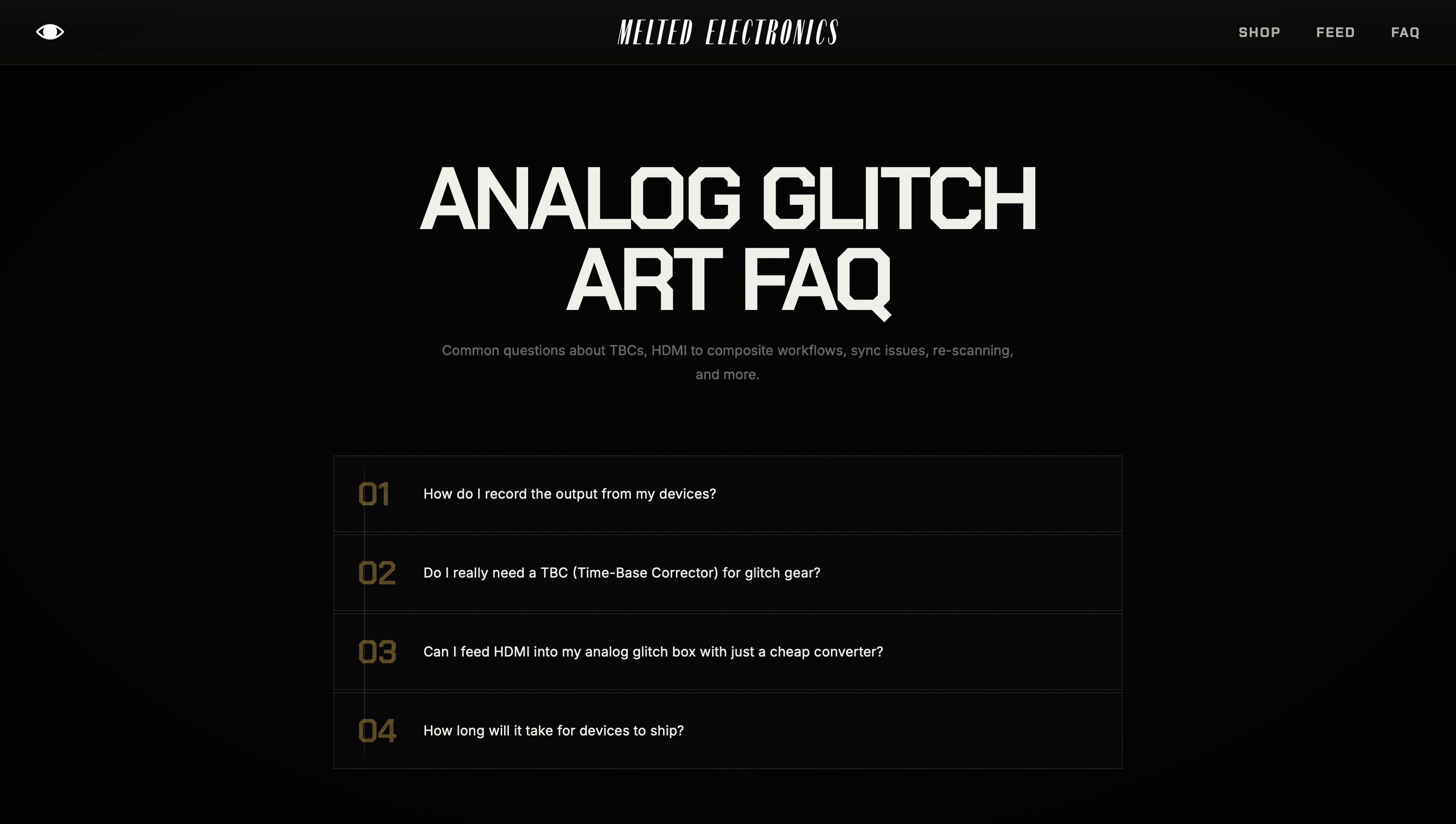
The homepage introduces the company: what they make, how the hardware is used, the visual world around the products, and current experiments and releases. From there, the site branches into four distinct layers: Shop, product pages, Feed, and FAQ.
Separating those areas lets each one move at its own pace. Shop handles direct browsing, product pages carry the deeper sales and context layer, Feed shows outputs and experiments, and FAQ removes friction around technical setup and compatibility.
04.1 — Site section
04.2 — Site section
04.3 — Site section
04.4 — Site section
05 — Core Flows
The site serves two very different visitors: returning users who know what they want and need a direct route to the shop, and new visitors who need time with the devices, the visual culture around them, and the broader ecosystem of experiments before purchase makes sense.
The structure supports both without collapsing them into one. Direct purchase stays fast. Discovery moves through Feed, FAQ, and product context at its own pace before transitioning into the shop.
05.1 — Direct purchase flow
Returning users can move into the shop without cycling through the discovery layer. Intent-driven visitors get a direct path — no forced re-entry through brand storytelling.
05.2 — Discovery and exploration flow
New visitors can stay in discovery longer, using the homepage, Feed, and FAQ to understand the devices before committing to a product page. Useful for people arriving through curiosity, not just purchase intent.
05.3
05.4
05.3
Editorial exploration and product detail share one visual system, so the transition into shopping feels earned rather than abrupt.
05.4
Mobile discovery keeps the same slower, editorial pacing while making the path into product detail feel clearer and easier to follow on a smaller screen.
06 — Constraint
Implementing real-time interactivity inside an Astro static build introduced a set of concrete engineering constraints. Video assets needed to load efficiently without degrading homepage performance; the custom GLSL shader required testing across browsers to stay stable; and the 3D CRT section needed careful scope decisions to remain performant on real hardware.
Several planned interactive moments were simplified or deferred during build — where implementation cost clearly outweighed the experience benefit. Deciding what to cut and when shaped the final site as much as any visual decision.
Video and animation assets were compressed and conditionally loaded to keep the homepage responsive without cutting the interactive moments that carry the most weight.
The custom GLSL shader required iterative testing and adjustment across environments to maintain consistent glitch behavior without degrading to a fallback.
Several interactive moments were intentionally simplified or deferred — keeping the build stable and the experience coherent rather than shipping everything at once.
07 — Outcome
The result sits closer to an active media platform than a conventional online store — clearer distinction between discovery and purchasing, more intentional navigation between content types, and a homepage that reflects the experimental character of the brand rather than just hosting it.
The atmosphere, visuals, and experimentation stay central, but they now work in service of browsing, understanding, and buying instead of competing with them.
Discovery, documentation, and direct purchase now have distinct paths, so first-time visitors can explore while repeat visitors move straight to the shop.
Homepage interactions demonstrate what the hardware does, reducing the need to explain the brand only through static product imagery or copy.
The visual system concentrates the most intense brand moments into specific sections, preserving atmosphere without making browsing or purchase harder.
08 — Reflection
The project became less about designing individual pages and more about designing the transitions between curiosity, understanding, and purchase. Not every visitor arrives ready to buy, so the site had to support more than one pace without splitting into disconnected modes.
It also reinforced that the hardest decisions on a project like this are the scope ones — knowing when a moment genuinely earns its place versus when it adds complexity without benefit. The most impactful cuts were the deliberate ones, not the ones forced by deadlines.